The exhibition publication’s visual identity reflects the Pavilion of Finland’s story

The book supporting the Pavilion of Finland’s exhibition at the upcoming Biennale Architettura 2025 delves deeper into themes related to the preservation and maintenance of architecture. Graphic designer Samuli Saarinen drew inspiration from the various historical layers of Finland’s iconic pavilion building.
The Pavilion – Architecture of Stewardship, which will open at the 19th International Architecture Exhibition of La Biennale di Venezia on 8 May, highlights the people and labour required in the preservation and upkeep of architecture, often remaining in the shadow of the original designer. Curated by architects Ella Kaira and Matti Jänkälä, the exhibition focuses on the very venue in which it is presented: the Pavilion of Finland in Venice’s Giardini della Biennale Park, designed by Alvar Aalto’s office in 1956.
An integral part of the exhibition, which recounts the story of the Pavilion through an audiovisual work, is a book published in conjunction with it. Architecture of Stewardship, edited by the curators, Kaira and Jänkälä, expands on the exhibition’s themes and offers a wealth of additional insight not only into the Pavilion of Finland but also into its broader context in Venice.
Both the minimalist graphic identity of the exhibition and the visual design of the publication were created by graphic designer Samuli Saarinen, known particularly for his thoughtful and inventive use of typographic elements in book design.
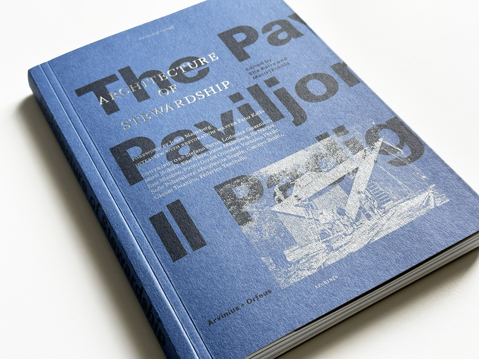
Typographic solutions inspired by history
Architecture of Stewardship not only tells the story of the small, yet iconic wooden building designed by the renowned Finnish architect, it also looks at architecture from an unusual perspective of ongoing maintenance and stewardship. The thrice-restored Pavilion of Finland carries many stories and historical layers.
“The book’s visual identity is an almost blatantly literal interpretation of these historical layers,” explains Samuli Saarinen.
“I’ve used two different grid systems for the text column layout. One of them is based on the classical Renaissance central symmetry, where the size and position of the columns are geometrically defined. The other one is a more dynamic and modular modernist layer.”
This systematic approach is not typical for Saarinen, but for this book, he felt it was essential.
“The exhibition curators had studied old Venetian publications, and their wish was to bring their atmosphere into the book. Although my usual working method is more intuitive, I wanted to take the historical references seriously.”
Different overlapping layers are also visible in the typography, where various overlapping registers have been used to create hierarchy. The main body text is set in a classic serif typeface, while the modernist font, according to Saarinen, creates a detached meta-level.
“For the book and the exhibition, the curators went through countless different documents and archival materials. The third typographic register is a reminiscent of the world of telefax machines; it replicates a document,” Saarinen continues.
“With the different overlapping layers, I aimed to evoke the atmosphere of a disorganised pile of documents, because despite its systematic nature, the book is intended to be a visually engaging whole.”
Iconic blue – or is it?
After completing his bachelor's degree in visual communication design at Aalto University, Saarinen went on to study for a master's degree at the Sandberg Institute of the Gerrit Rietveld Academy in Amsterdam.
“In the Netherlands, the approach is more craft-based, with a strong emphasis on the materiality of print products. This has had a significant impact on my own working method. For example, in this book, where resources were limited, simple methods were used to create a sense of materiality,” Saarinen explains.
The book predominantly uses just three colours: black, blue, and silver. The order in which the colours are printed was important to the designer.
"Metallic colours react differently with light, they feel more physical than other colours. Here silver was the little ‘poetic device’. It was important that the silver colour was printed last, so that it partially covers the colours underneath. The end result was not entirely predictable, but I think the process is more important than just the visuality of the final product."
Another small but significant feature in the book and all the exhibition-related materials is the variation of the blue colour: on the book’s cover, it is slightly different from that on the inner pages, and various shades of blue appear in the exhibition graphics, brochure, tote bag, and social media posts.
“The variation in colour echoes the story of the Pavilion of Finland, as the shade of the structure itself has changed over time,” Saarinen explains.
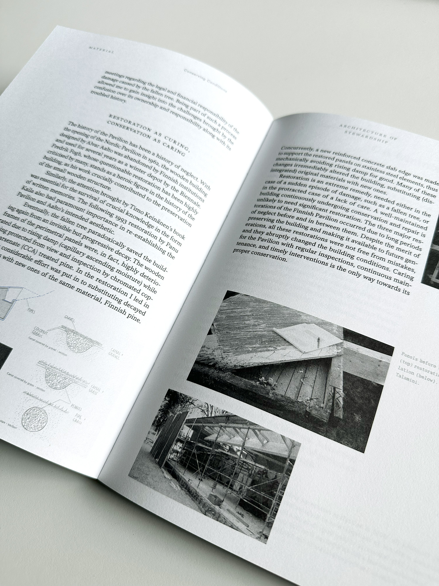
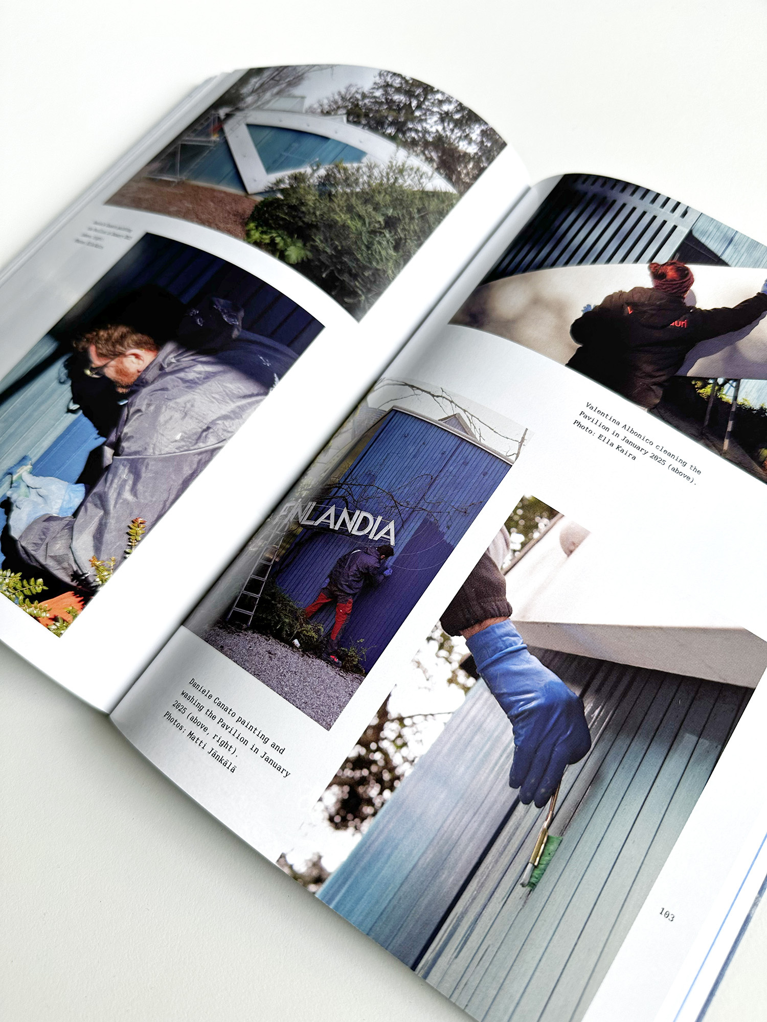
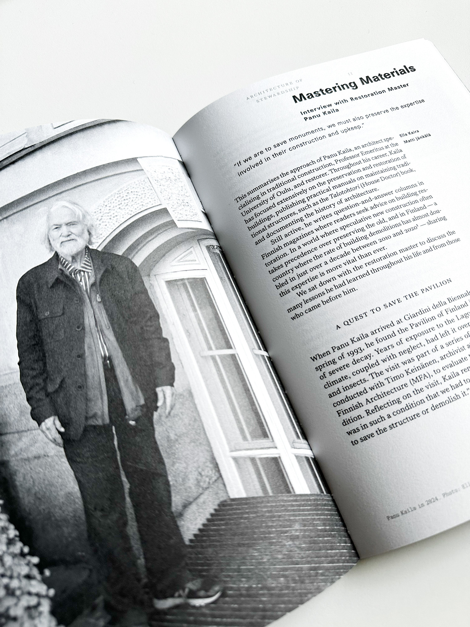
After the first restoration of the Pavilion of Finland, renowned for its blue colour, no original paint surfaces were preserved, and the shade of blue has varied over time. In the book, artisan decorator Corrado Pedrocco, a long-time maintenance worker at the Pavilion, recalls how he learned from architect, Professor Emeritus Panu Kaila, who led the 1993 restoration, how to mix the precise paint color. The formula came from a blend of Berlin sky blue – often referred to as Prussian blue – smoky black, and lead white.
"Exposure to the elements also affects the colour of the Pavilion, which fades over time before being repainted. The blue of the book is not the blue of the Finnish flag, but the blue of the Pavilion, with all its variations over time.”
The exhibition publication is also a stand-alone book
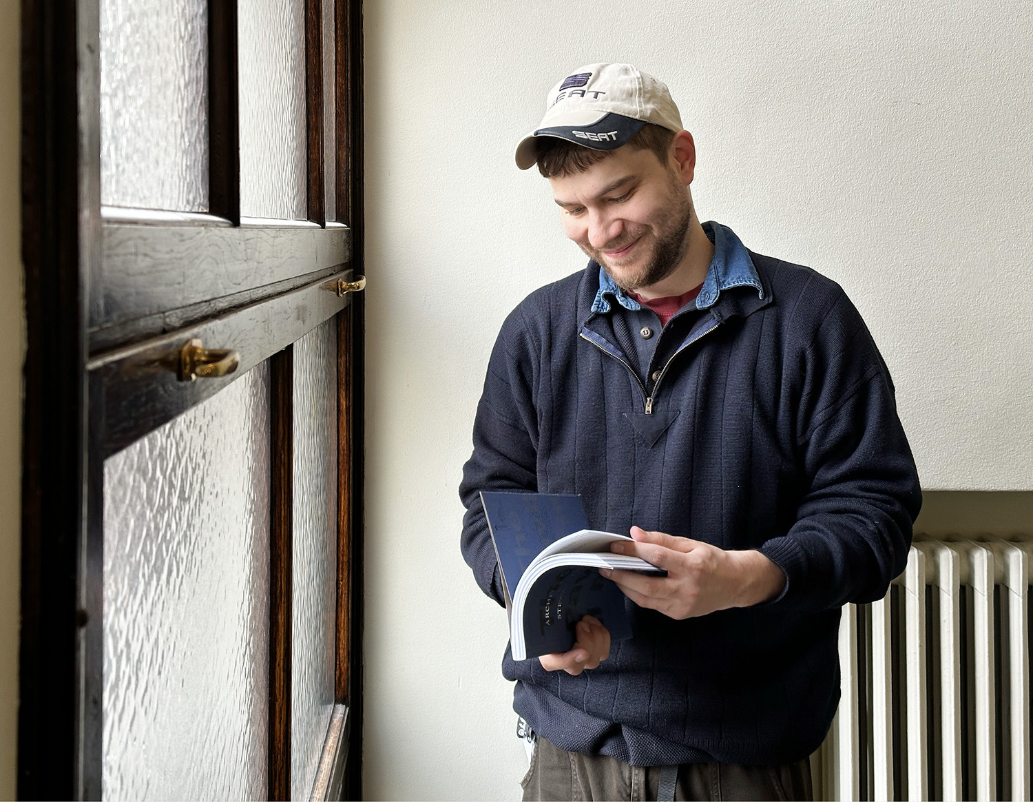
The 156-page English-language book, Architecture of Stewardship, includes a foreword by architect Jonas Malmberg, who has worked extensively with Alvar Aalto’s architectural heritage, as well as fourteen essays and articles written by Finnish and Italian experts from various fields. The book also features interviews with people who have worked on the Pavilion of Finland.
In the introductory chapter, the book's editors Ella Kaira and Matti Jänkälä introduce the concept of stewardship and discuss the various phases of the Pavilion of Finland. The book is divided into three sections, each of which is explored in the editors’ respective essays.
Part I, ‘Land’, explores the human relationship with nature through three essays, describing the changes in the fragile ecosystem of the Venice Lagoon and the future prospects for the city. Part II, ‘Material’, examines how our built environment manifests human agency. The section covers the restorations of the Pavilion of Finland and gives a concrete description of its maintenance work. Part III, ‘People’, delves into the relational aspects of stewardship and deeper into responsible care from both a legal and grassroots perspective.
The book, published by Archinfo in collaboration with Stockholm-based Arvinius + Orfeus Publishing, is available in Venice at the Pavilion of Finland and the Biennale bookstores, in Finland at Pp. Bookstore and the publisher’s online store.
The book will be released on 8 May in Venice, in conjunction with the exhibition opening. The Biennale Architettura 2025 will be open to the public from 10 May to 23 November.


